(Photoshop)
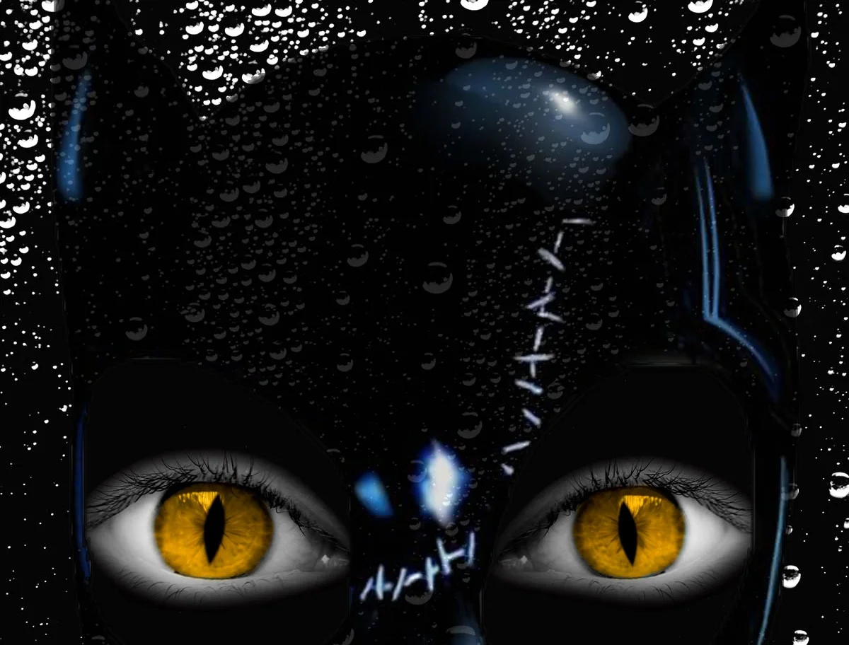
THE PROJECT – Catwoman is a fictional character featured in American comic books; she is portrayed as the antiheroine and Batman’s adversary. I recreated what the poster would look like for the film Catwoman. I wanted the movie poster to have a mysterious feeling to it with a simple layout, as opposed to having a lot going on in the movie poster to the point of viewers knowing what the plot summary is.
THE DESIGN – My poster consists of a dark raindrop background with Catwoman’s mask and eyes peering out of that darkness. The audience will automatically know who the main character of the movie is with her iconic cat ears and glowing cat eyes. As far as the movie title goes, I decided to go with a bold, legible font and added red claw marks at the end of the title for some aesthetics. The design issue that I had with this particular piece was drawing out the masks and eyes of the main graphic. Using Photoshop, I had to cut around the mask where the eyes are and place a set of cat eyes inside. Then I had to color around the eyes to make it match with the rest of the mask, so that it comes together as one cohesive element on the movie poster. Comparing my creation of the Catwoman movie with existing movie posters, I think that it denotes the same type of mood and resemblance of who Catwoman is as a character.
(Illustrator, Photoshop, Typography)
THE PROJECT – I have always been a fan of seeking out new music artists and genres to listen to. Attending music festivals and concerts is an enjoyable activity for me, not only to see some of my favorite artists perform on stage, but also to have the opportunity to listen to music that I may not have otherwise listened to before. Coachella is an annual music and arts festival at the Empire Polo Club in Indio, California, originating in the year 1993 with its first ever concert.
THE DESIGN – With this particular graphic design project, I wanted to re-create the event poster in my own interpretation. Utilizing Illustrator, I decided to take certain elements of the music festival (such as the DJ, Ferris wheel, palm trees, and butterfly) and include them in the poster. In addition, I chose to keep the format of how the 3-day lineup of artists was displayed. As far as the Coachella logo goes, I created a new typeface for the festival brand. The logo has a wavy feel to it that I believe still represents what the festival is all about. I also added the bright neon-colored gradient to make the poster pop and stand out, calling attention to all festival goers.
(Photoshop, Illustrator, Dreamweaver, Branding)
THE PROJECT – MIA Graffiti is a fictitious graffiti art supplies store targeted towards street artists. I came up with the name MIA Graffiti because many graffiti artists are anonymous, leaving their signature mark on a wall but never revealing their true identity. Take for example, the European artist known as Banksy whose work is known everywhere for its political and social commentary, but nobody knows who he really is.
THE DESIGN – With this project, I first started out by designing an event poster. The event I created is the MIA Graffiti Jam located in the Mission neighborhood of San Francisco, California. The idea for this event would be that all local artists would come together and make art on public wall space to showcase their creative talent. The design problem I faced was creating the logo for this business and determining which typeface to use. Since my logo consisted of so many bright colors, I had to analyze which typeface would be appropriate to not only represent the brand itself but it also had to be legible and clear to viewers what exactly this business is selling. I think the typeface style and color I chose ultimately did just that - it was very straightforward what my brand was all about. With the creation of the event poster, I proceeded to develop and code a working website for this made-up business. I created numerous webpages full of content, including categories like: About Us, Graffiti Supplies, Gallery, Events, Blog, and Contact. This brand is made for a niche group, so both the designed event and the website aim towards a targeted audience.
(InDesign, Photoshop, Typography, Branding)
THE PROJECT – Nomad Magazine is a fictitious travel publication that will fulfill the wanderlust desires of its adventurous readers. This issue of Nomad Magazine revolves around the New 7 Wonders of the World aimed to represent global heritage. These 7 Wonders of the World include: Great Wall of China (China), Christ the Redeemer Statue (Rio de Janeiro), Machu Picchu (Peru), Chichen Itza (Yucatan Peninsula, Mexico), Roman Colosseum (Rome), Taj Mahal (India), and Petra (Jordan).
THE DESIGN – In this magazine, each spread concentrates on a different wonder of the world. I wanted to make my magazine enticing to viewers with interesting written content, in addition to stunning graphics. A particular challenge I had with this specific project was figuring out the layout of the magazine, and how all of the images and typography would flow together. Ultimately, I decided on a layout that would highlight the breathtaking graphics, but not take attention away from the informative articles.
(Illustrator, Branding)
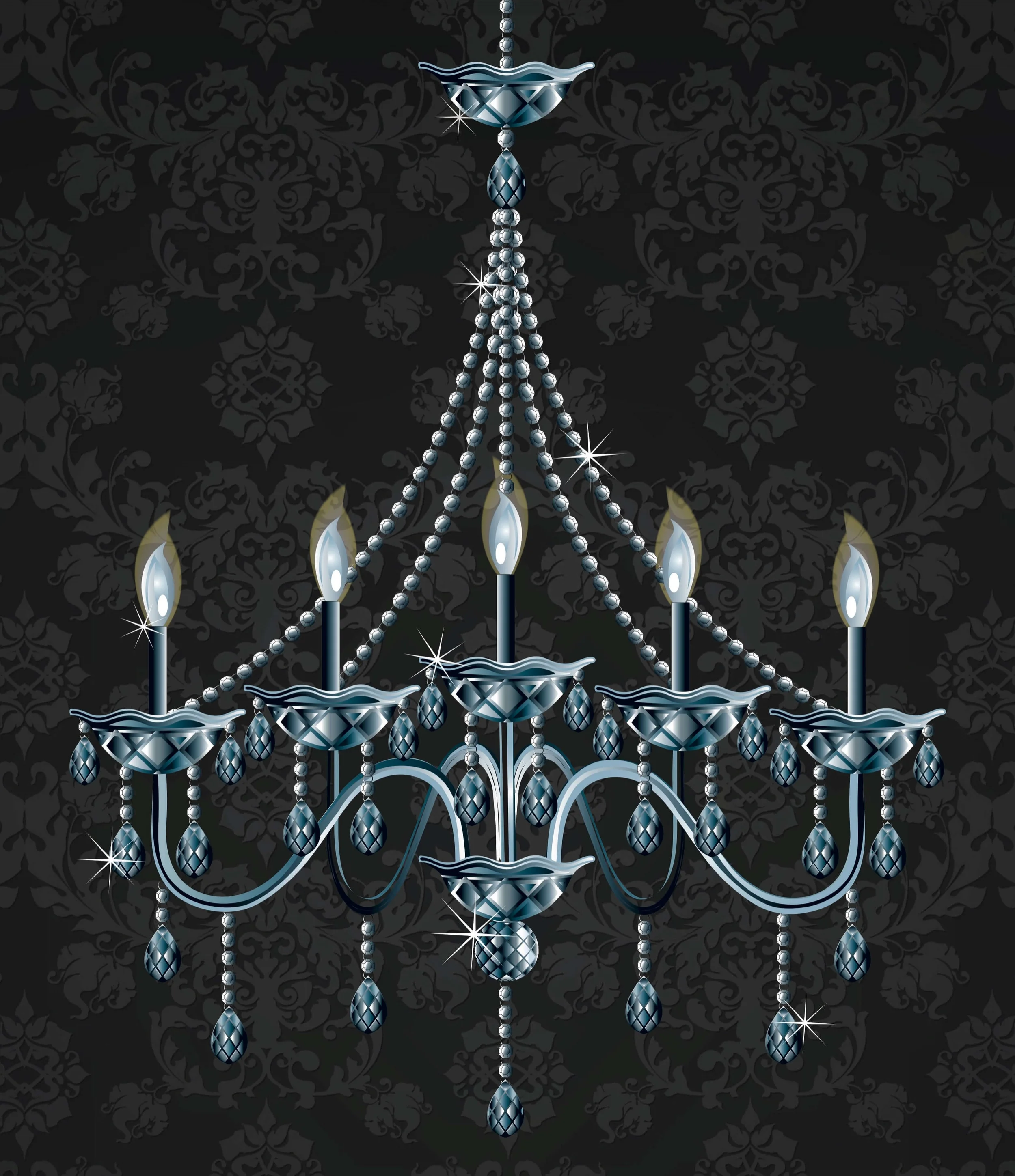
THE PROJECT – Illuminations is a fictitious lighting and home décor retailer, specializing in chandeliers. For this project, I created a realism ad with the chandelier as the main focus. A chandelier is an ornamental light fixture utilizing incandescent light bulbs and mounted on a ceiling or wall. Typically, chandeliers include hanging crystal prisms that illuminate light throughout the entire room. The material that the chandelier is made out of resembles a mirror effect among its decorative features.
THE DESIGN – Picking a chandelier to recreate in Illustrator was a big obstacle to take on and this design involved a lot of detailed, meticulous work. Chandeliers are typically made of crystal or glass, so I was attempting to create that same effect by using various gradients and color tones. The most challenging part of this design was trying to make the product look as realistic as possible with the illustration. Every little piece of the chandelier was composed of different elements, so that in the end the final product would look like the real product.
(Typography, InDesign)
THE PROJECT – For this project, I designed three Type Classification posters that highlight a specific serif or sans-serif typeface: Baskerville, Garamond, and Verdana. I wanted to play with the typography layout and showcase the characteristics for each typeface, the lines and curves of each individual letter or number.
THE DESIGN – Each poster consists of the name of the typeface, the year it was designed, who created it, and the letters and numbers of the typeface. The most challenging part of this project was laying out the written text, making sure there are no rivers, orphans or widows within the paragraph itself, in addition to allowing for enough negative white space.
(Typography, InDesign, Branding, Photoshop)
THE PROJECT – The Blue Lagoon is a geothermal spa located in the heart of the Icelandic landscape. It is one of the 25 Wonders of the World and serves as an oasis of relaxation. The Blue Lagoon offers guests with different spa packages, hotel accommodation, and various food and beverage options.
THE DESIGN – For this project, I designed a tri-fold brochure for the Blue Lagoon with a lot of photography of the lagoon, calming colors, and informational written content. A challenge I had with this design was the layout of the brochure. There was a lot of content that needed to fit, and I didn’t want the tri-fold brochure to look crowded or illegible. My use of columns, margins and spacing allowed me to neatly fit all of the important information that is needed for spa guests to be knowledgeable of everything that the Blue Lagoon has to offer.
(Branding, Illustrator, Packaging)
THE PROJECT – Chocolatier is a family-owned storefront that sells the most indulgent gourmet chocolates, truffles, and other premium sweets. From white chocolate to milk chocolate, dark chocolate to semi-sweet, Chocolatier prides itself in creating premium treats since its inception in 1927.
THE DESIGN – I began this design project by creating the logo and packaging for the Chocolatier brand. I designed a gold leaf pattern with a gradient to give it a metallic look. I then utilized this pattern across the whole Chocolatier packaging and branding, and developed different flavors of the chocolate truffles: mint, caramel, raspberry, and blueberry. The most challenging aspect of this project was illustrating the leaf pattern and creating the gradient. With each flavor of truffle, I used numerous colors to come up with a new gradient for that particular product. Not only does Chocolatier offer a wide variety of chocolate goodies, customers may also shop at its storefront and purchase other merchandise items.